Enhancing the digital experience to increase botanical knowledge and curiosity

At the client’s request, I conducted a UX Audit to identify issues within the website. These issues were categorized into short- and long-term improvements that the team could address.

Ultimately, a comprehensive advisory document was delivered, and I am eager to see how De Hortus continues to evolve, much like the beautiful historical garden itself.

Project

UX Audit

Roles

Project manager
UX Design
UX Research
Trend Research

To kick off user research, interviews with the team were conducted. They shared their own experiences with the website as well as feedback they had gotten from users and visitors.

After compiling the data, three big user needs formed the base for improvement.

Navigation

Layout

Knowledge

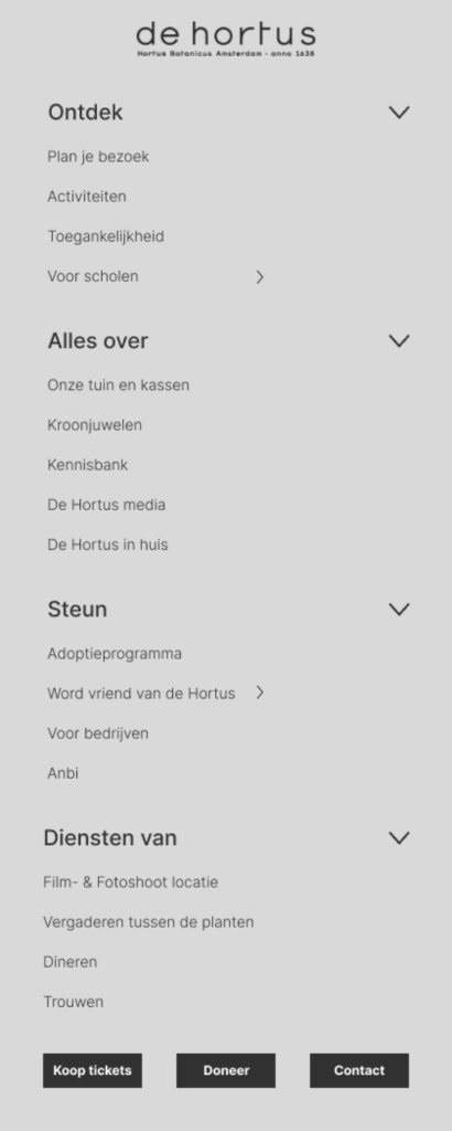
Creating structural navigation through user stories.

To gain more perspective on user goals, interviews and competition analysis were done. This led to a more simple categorization. To protect simplicity, it was adviced to combine pages wherever possible. Due to double information and unclear titling.

The categorization is as follows: Discover, About, Support and Services with Quick actions concerning tickets, donating and contact.
The old Navigation

Redesinging the page lay-out for maximum efficiency.

The current webpages have a combination of horizontal scrolling across subpages and vertical scrolling within the page. This led to disorientation. The goal for the wireframes was to make a more efficient design, reducing the scroll length and reducing the white space while remaining clean.

Old page

Putting botanical knowledge in the spotlight.

Currently, the website focuses more on practical information, when De Hortus has a database of knowledge. Additionally, they make it intertactive by creating videos, podcasts and photography. These other media deserve their own spotlight, making botanics cool again.

Refreshing De Hortus to fit the Dutch cultural scene.

To conclude the research, De Hortus requested trend research for a possible new branding. I looked at significant cultural locations in Amsterdam as inspiration. The following trends recurred: Bold graphics, Bright accents, Serif & Sans pairings, Historical and modern style pairings, Minimalism is out.

Time to revamp your cultural company?

Scroll to Top